The Work- Clinical Calendar
Appointment length became the information hierarchy
Of the surfaces I redesigned, the calendar concentrated the most complaints and shows the method most clearly. Buttons were scattered, every appointment card tried to show everything at once, and the most-scanned piece of information — the client's name — was buried third in the visual hierarchy, after time and a cluster of action buttons.
The real design tension wasn't visual, it was between two user mindsets I'd mapped. Experienced users, many with ten-plus years in the legacy product, valued efficiency and familiarity above all, and when the beta shipped they had one non-negotiable demand: "I can't see the full day." They wanted everything visible at once. Newer users pulled the other way: several who wore glasses or contacts told me condensed cards forced them to zoom in to read anything. Showing the full day meant denser cards; denser cards hurt legibility. I couldn't fully satisfy both with a single card.
Appointment length became the way through. Instead of every card carrying the same load, what a card showed scaled with how long the appointment was — a 15-minute check-in and a 45-minute session aren't the same information problem. That preserved the full-day visibility legacy users demanded while keeping the most critical information legible against the accessibility standards the original calendar failed. The tradeoff was deliberate and named, not stumbled into: less detail on the shortest cards, in exchange for a full day that everyone could still scan.
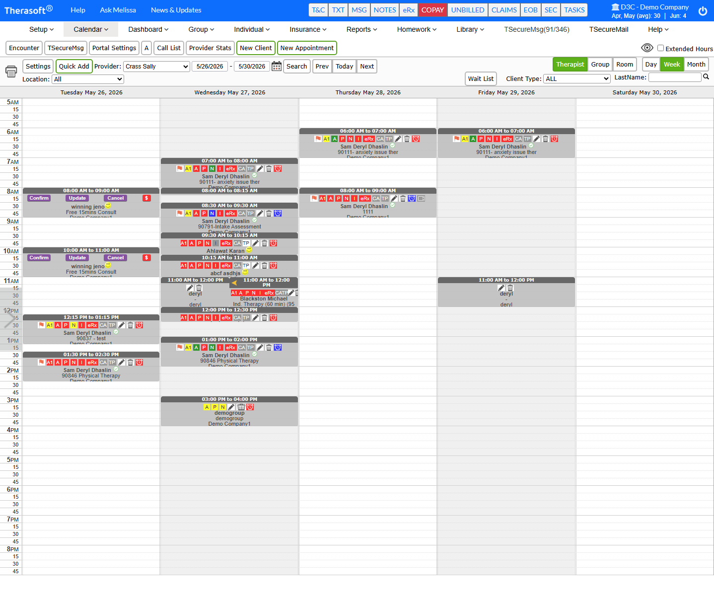
Original card: time and task buttons dominate; client name appears third in scan order, low contrast on red/green states.
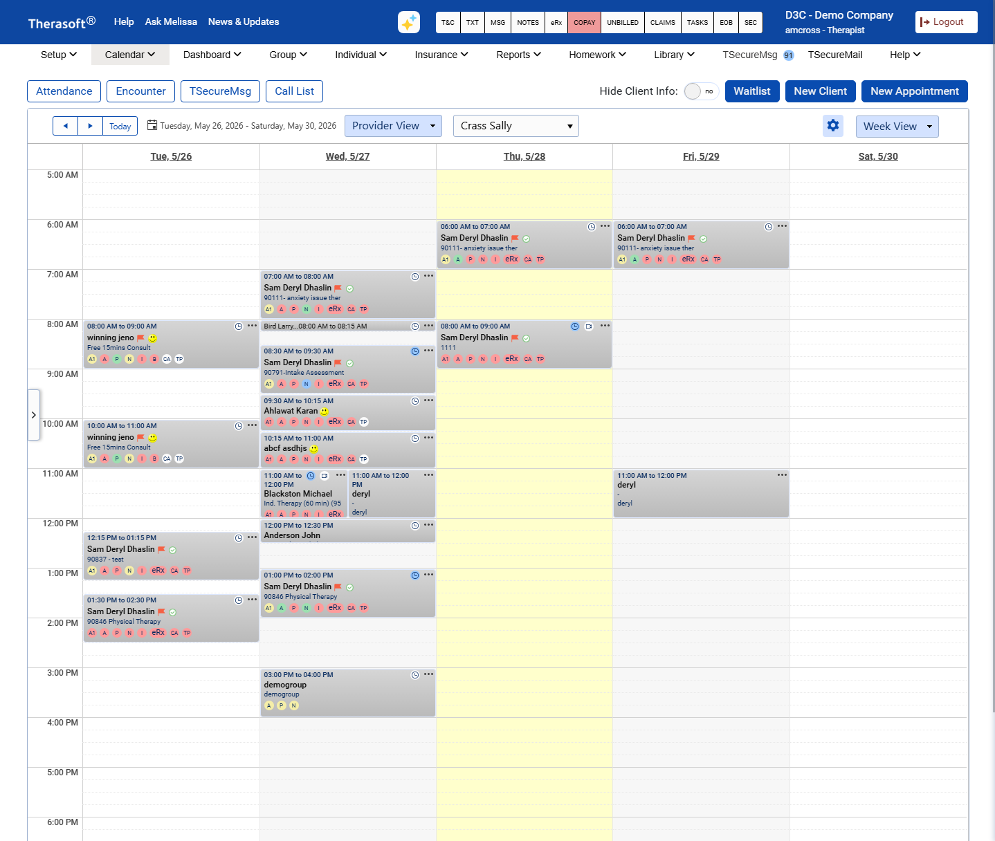
Redesigned card: name promoted to dominant element, three-tier hierarchy by appointment length (15 / 30 / 45+ min), interaction changed from hover to click to stop accidental triggers.
"It used to take me 5 minutes to create an appointment because I'd get distracted and easily click off the window."
- Therasoft customer, on the friction the redesign removed
