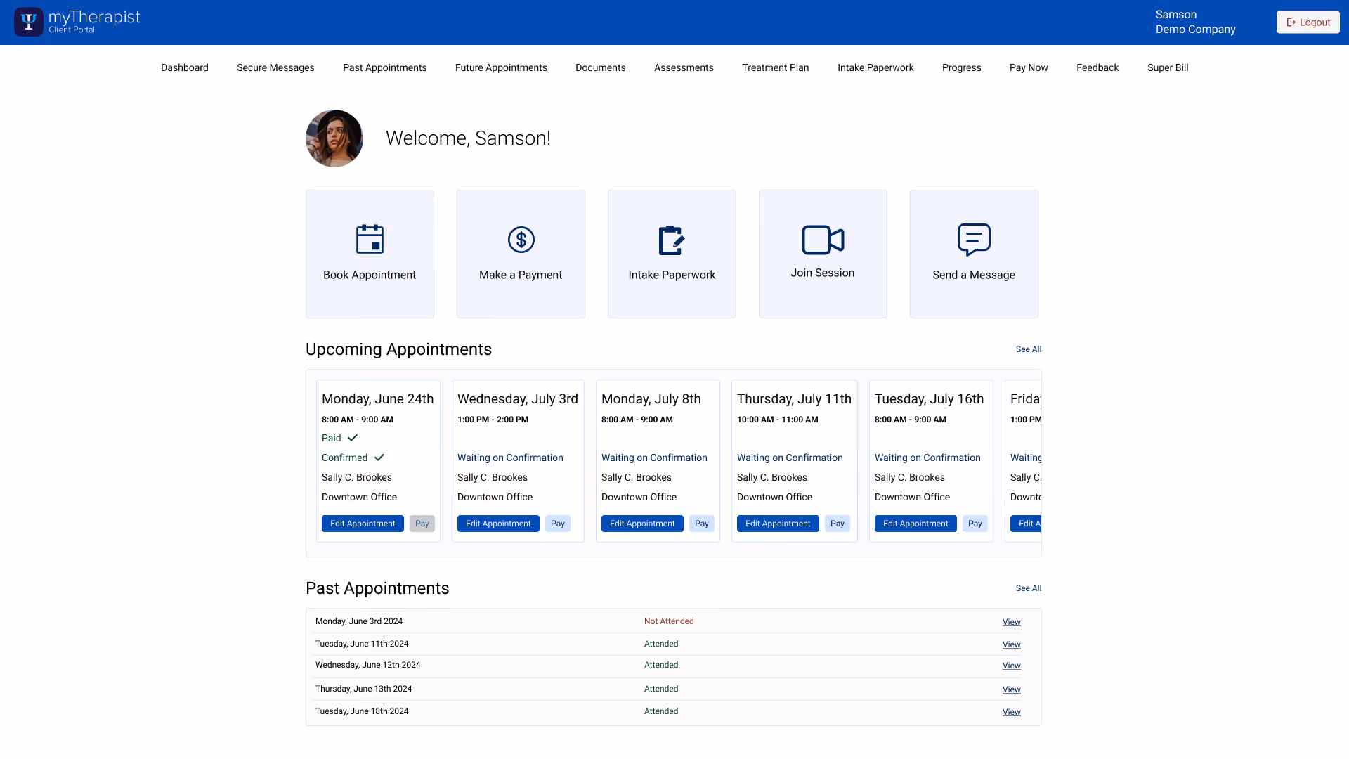
A patient portal that had grown to show everything, on the assumption that more visibility meant more value. I cut it back to the two things patients actually came for — and designed it mobile-first, because that's where patients actually are.
2
Daily tasks the portal optimizes hardest for: check the next appointment, pay the balance
3
Layers of financial detail reviewed and reduced to a single balance
0
One dashboard unifying the patient's key actions: book, pay, complete intake
The patient portal had grown the way most products do — feature by feature, each added because it could be, not because anyone confirmed a patient wanted it. Session costs, insurance payment details, per-appointment pricing, documents, superbills, a feedback module: all of it sat in front of patients on the assumption that more visibility meant more value.
The question I kept returning to wasn't "how do we make this look better." It was "what does a patient actually open this thing to do?" Working with clinicians who knew exactly what their clients struggled with and asked for, the answer sorted cleanly: day to day, patients did two things — checked their next appointment and paid what they owed. Booking and intake mattered too, but they were periodic, not daily. Everything beyond that small set of actions was noise patients hadn't asked for and had to navigate around.
Features had accumulated on the belief that showing more served patients. No one had asked whether the added visibility helped or just added friction.
The portal exposed session cost, insurance payments, and per-appointment pricing — when patients overwhelmingly just wanted to pay down a balance, the way most patient portals work.
There was no real self-service booking. Patients had to message or call to find a time — left wondering "so when can I actually book?" instead of just seeing what was open.
On the app, choosing "I'm a patient" left users unsure where they'd landed — the patient and provider flows shared a login with no clear sense of place afterward.
The work wasn't to add a better portal; it was to subtract down to the real one. I started from how comparable patient portals behave (most show only a copay, not a full financial breakdown) and from what the clinical team knew patients actually requested, then made deliberate cuts: remove session cost and insurance payment detail from the patient view, strip pricing out of past appointments entirely, and reframe payments around paying down a balance rather than line-by-line per appointment.
Then I chose mobile-first, not as a default but as a decision. The patient userbase lives on their phones; they book, pay, and check appointments on the move, the same way they handle everything else. Designing for the desktop first and shrinking it down would have optimized for the device patients use least. So the phone was the primary canvas, and everything was designed to work there first.
Subtraction wasn't the whole job, though. Where patients genuinely lacked a capability — real self-service booking — I built it. The skill wasn't only knowing what to cut; it was knowing the one thing worth adding, and adding it without reintroducing the complexity I'd just removed.
The redesign's backbone is a single dashboard that puts a patient's key actions one tap away: book an appointment, pay, and complete intake paperwork, all from one place instead of scattered across pages a patient had to learn. It opens on what matters daily — the next appointment and a clear balance with one way to pay it. Past appointments show their details cleanly, and payment is reframed around the balance, so patients can pay in full or in part without reasoning about session costs and insurance math that was never theirs to untangle.
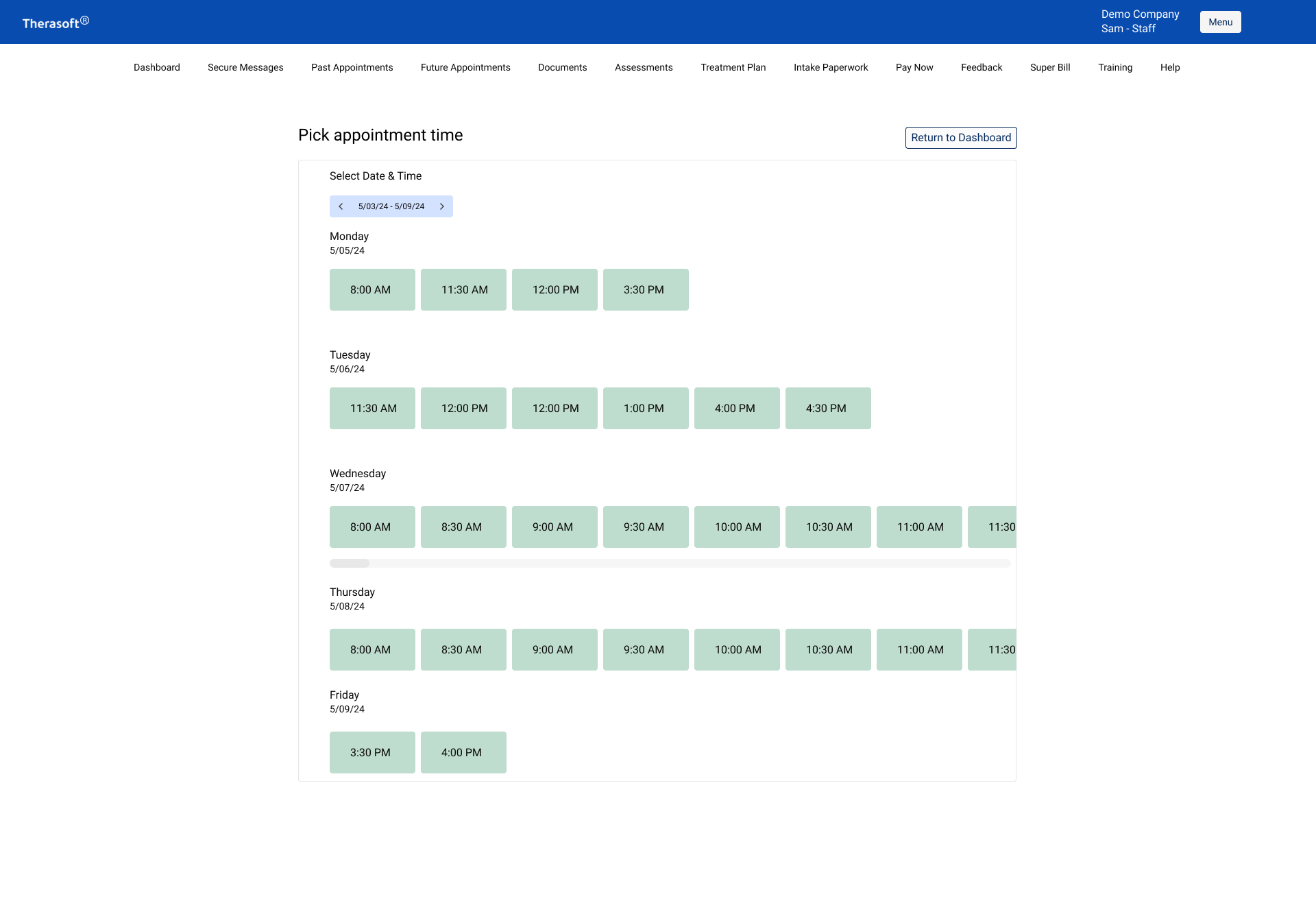
"Show what's open, never reveal what's taken"
- Design principle behind the booking flow
The booking flow existed before the redesign — technically. Patients landed on an open calendar with no indication of what to do next: nothing signaled that clicking a date was how you requested an appointment, and nothing guided you toward booking at all. Patients who couldn't decode the screen fell back to messaging or calling the practice, which meant the feature was failing at the exact job it existed to do. That failure is what drove me to rebuild the booking flow as a guided path instead of a silent calendar.
But the harder call wasn't whether to show availability — it was what not to show. A patient doesn't need a full calendar, and they absolutely shouldn't see when a clinician is booked. Showing booked time, even as a blocked-out slot, quietly leaks information: it implies other clients, exposes a clinician's private schedule, and turns a booking screen into a surveillance surface. So the design shows only available times, and never indicates that a clinician is busy at any specific time. The patient sees what's open and picks from it.
"We don't want our clients to have to ask 'so when can I book my appointment?'"
- QA testing standup on HIPAA compliance
The sections below hold the fuller story — how I decided what to remove, why payments got reframed, the rules behind self-service booking, and why mobile-first was a deliberate call.
01
Naming the portal's real job before touching the design
Filter: if a feature didn't serve viewing an appointment or paying a balance, it had to justify its place — or leave.
02
Copay and balance in, session cost and insurance math out
03
Designing for where patients actually are
Principle: design for the device and the moment your user is actually in — for patients, that's a phone, on the move.
04
Practice policies, confirmations, and a bug I caught testing my own flow
05
"I'm a patient" — and then what?
06
The open questions I'd want answered
Two moves carried the redesign. I cut the financial clutter that confused patients, collapsing a tangle of session costs and insurance detail into a single clear balance. And I built the one capability they actually lacked: real self-service booking that surfaced open times directly, so no one had to ask "when can I book?" and no one ever saw when a clinician was busy.
The lasting lesson is that knowing what to remove and knowing what to add are the same skill. Anyone can pile on features; the harder calls are deciding what a patient doesn't need to see, and then adding the rare thing that's missing without dragging the old complexity back in. The booking flow did both at once: show what's open, hide what's taken, and let a patient act in one tap.